RACV case study cover

RACV · Senior UX Designer · iOS & Android

RACV

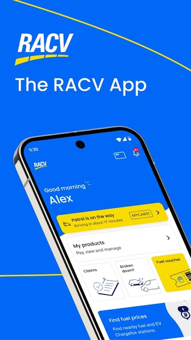
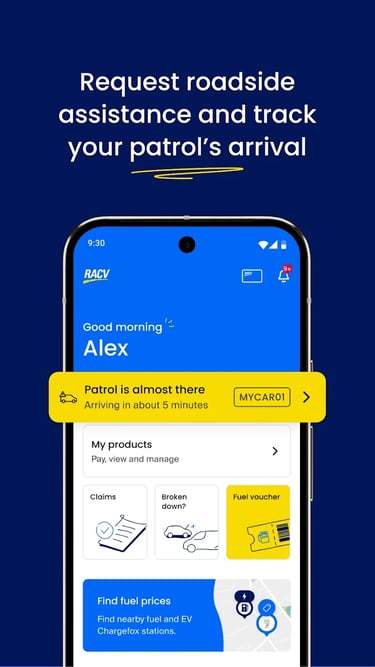
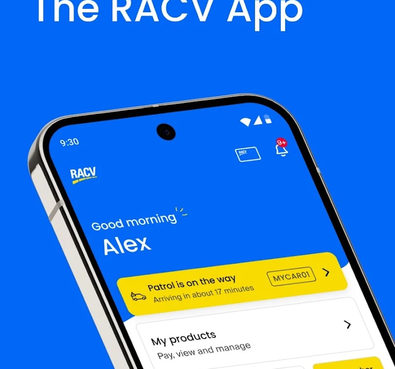
The RACV app: roadside assistance, insurance, discounts and membership management, redesigned across iOS and Android for a member base of 2.1 million.

2.1M membersiOS & AndroidSalesforce Lightning + AEM

Objective

To deliver an enhanced, consistent experience across iOS and Android — reducing navigation friction, improving visibility of member benefits, and streamlining the Account and Home screen interactions.

Discovery

  • The Long-Term Loyalist — member since 1965, mainly uses the app for Roadside Assist and checking membership status; values simplicity and clear text.
  • The Value Seeker — actively uses the app for daily savings like Fuel discounts and movie tickets; the primary audience for the new Offers and News sections.

Pains

  • Information overload — the original Account screen was cluttered with non-account items like Special Offers and Latest News.
  • Navigational bottlenecks — services like Fuel and Discounts were buried or inconsistent across platforms.
  • Process delays — code reviews by the external ARQ Group created bottlenecks in Sprint 2, delaying deliverables.
  • Terminology confusion — labels like “Claims Lodgements” tested less intuitively than “Insurance Claims.”

Hypotheses

  • H1 — Contextual separation: moving Offers and News to Home makes the Account screen more useful because it stays strictly about the member's own information.
  • H2 — Visual consistency: a bottom nav of Home, Assist, Fuel, Discounts, Account increases feature adoption through clear, persistent access.
  • H3 — Process improvement: detailed design specs inside JIRA stories reduce code review delays and improve developer alignment.

Journey

Focused on “in-app exploration”: Landing (immediate value via News/Offers) → Engagement (checking Fuel prices or Discounts) → Support (Roadside Assistance or Contact Us) → Management (Account, digital membership barcode, insurance details).

Sitemap

Restructured into five core pillars:

  • Home — personalised content, news and offers.
  • Assist — emergency Home Assist and Roadside Assistance.
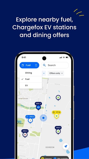
  • Fuel — real-time fuel price tracking and locations.
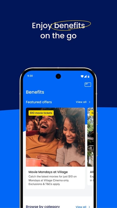
  • Discounts — Woolworths, movie tickets and partner savings.
  • Account — personal details, membership barcode and Contact Us.

Design approach

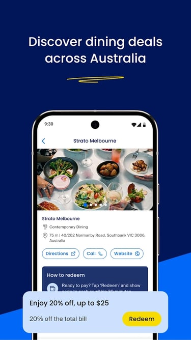
A transition from low-fidelity planning to high-fidelity “Enhanced Experiences”: a “You May Like” carousel on Home for Woolworths and movie-ticket discounts, an Account screen stripped of marketing noise down to the member barcode and tier status, and a redesigned Contact Us with actionable numbers for Insurance Claims and RACV Feedback.

Test results

Qualitative: “RACV Feedback” was added to Contact Us specifically to gather ongoing member sentiment. Business acceptance: every deliverable went through Test Acceptance with the Product Owner to confirm it met the original business requirements.

Conversion metrics

  • Offer click-through rate — measured after Offers moved into the Home screen's “You May Like” carousel.
  • Support call efficiency — measured via use of the refined Contact Us screen, cutting the time members spend hunting for the right number.

Success evidence

  • Deployment velocity — solving the ARQ Group bottleneck to keep sprints on schedule.
  • Consistent look & feel — 100% alignment between iOS and Android UI components.
  • Member sentiment — tracked through the new RACV Feedback loop inside the app.

Want the full deck?

This page covers the shape of the project. If you're hiring or shortlisting, I'm happy to walk through research artefacts, Figma files and the metrics behind the headline numbers.