University of Melbourne case study cover

UNIVERSITY OF MELBOURNE · Senior UX Lead · 2020–2022

University of Melbourne

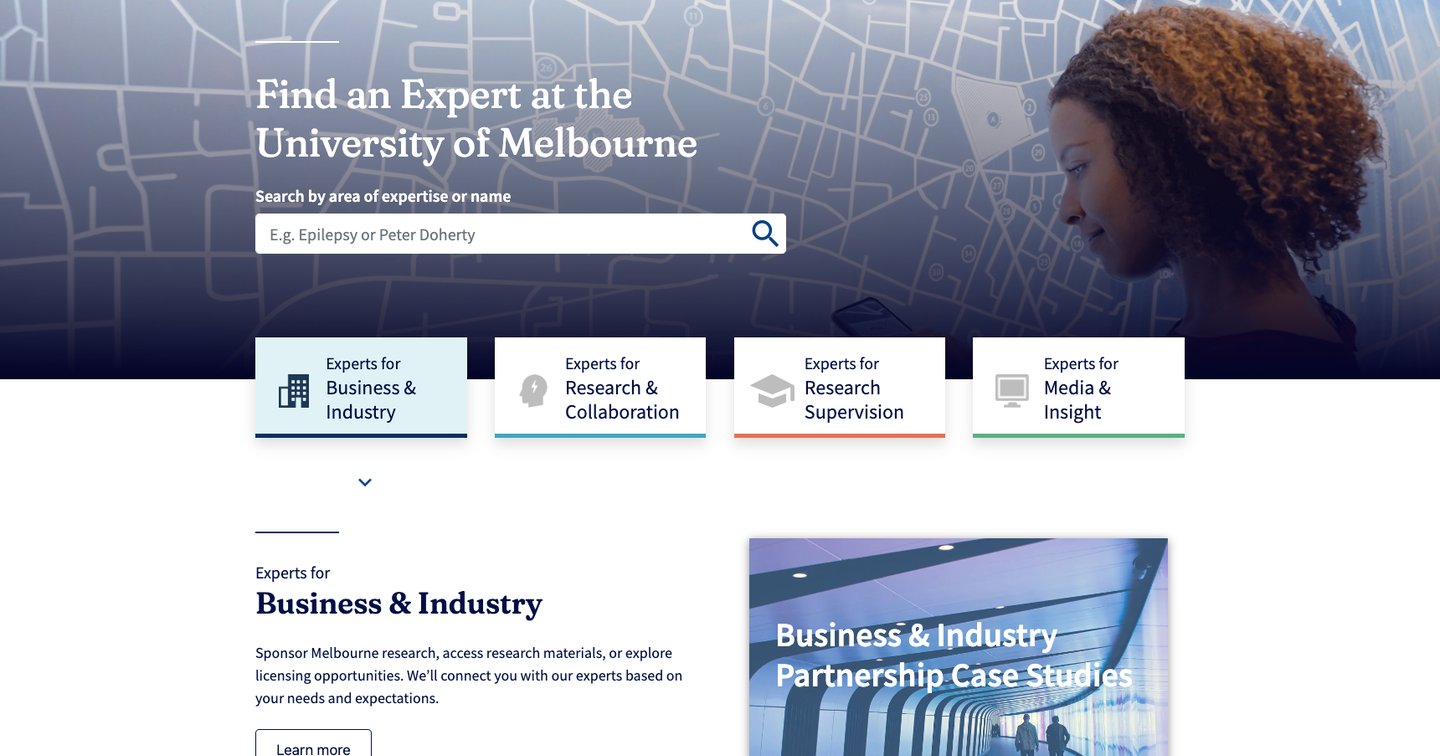
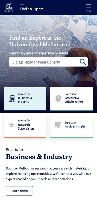
Find an Expert — repositioning one of Australia's largest research directories from a static list into a collaboration ecosystem for researchers, students, industry and media.
Higher education9,000+ experts2020–2022

Objective

To shift Find an Expert from a “directory” to a “collaboration ecosystem.” With 9,000+ experts, 2,500+ supervisors and 400k+ scholarly works, the challenge was never a lack of data — it was speed of relevance.

Discovery

Four user segments, built as fictional archetypes from research data:

  • Graduate Researcher — prospective students who use Google or site search to find supervisors, evaluate fit and identify academic support.
  • Supervisors & Experts — time-poor academics who need to represent their research professionally and manage supervision availability.
  • Industry Partners — business professionals seeking experts by sector, often overwhelmed by academic language.
  • Media Reporters — journalists on 1–3 day deadlines who need credible talent and rapid contact details.

Pains

  • Navigation complexity — users had to understand the University's faculty structure just to find information.
  • Administrative friction — graduate students found the application and scholarship process slow and disjointed.
  • Information reliability — outdated interfaces and unmanaged profiles undermined trust in the brand.
  • Communication gaps — researchers felt distant from central administration; generic email contacts were unhelpful.

Key questions

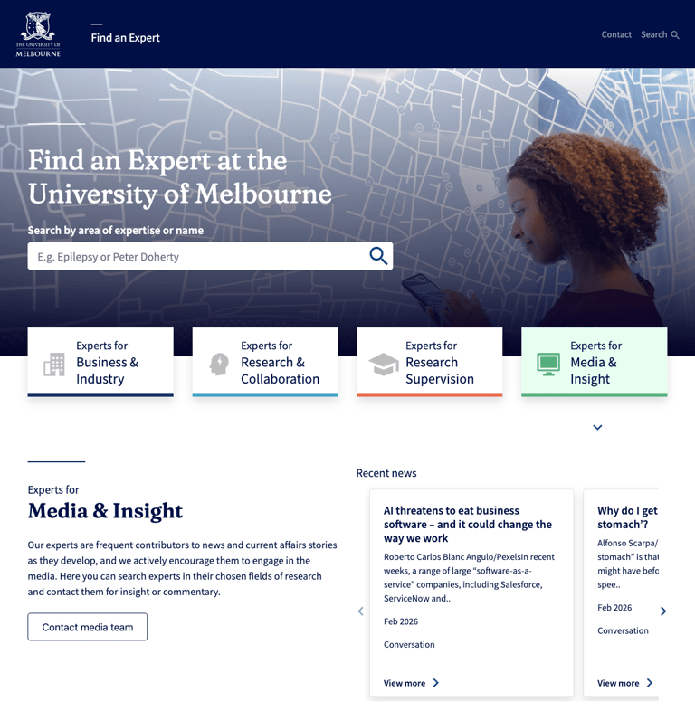
  • How might a graduate student find topics? A homepage section cycling through 22 research fields via filter “pills.”
  • How might a media contact find an expert fast? Let media search specifically for researchers available for collaboration.
  • How might a researcher keep their profile current? Give researchers control over their own details through Minerva Elements.

Journey

A Research Supervision Customer Journey Map spanning Selecting (finding supervisors, scoping facilities — often slowed by application friction) through Commencement/Experimentation (inductions, data collection and analysis, touchpoints with faculty peers and supervisors).

Sitemap

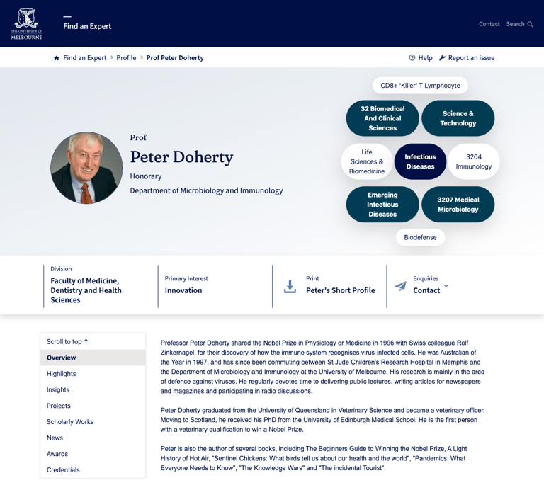
  • Landing page — leads into faceted search results and category pages (Topics, Org Units, Projects, Researchers).
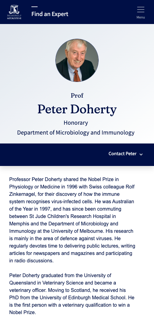
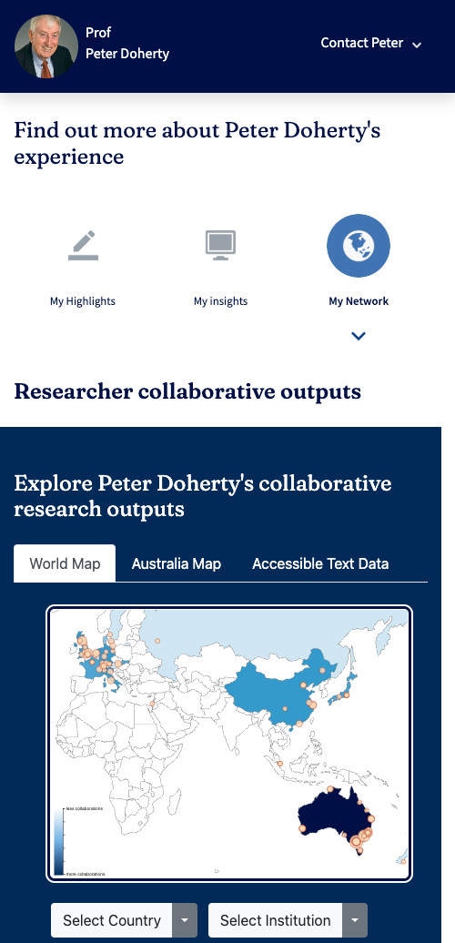
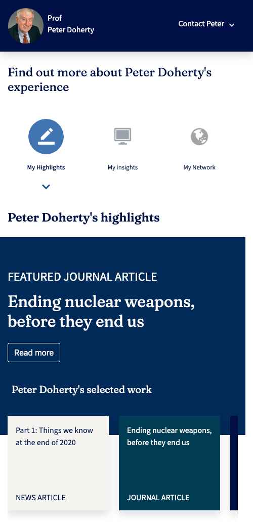
  • Researcher profile page — the core destination: scholarly works, supervision availability and contact information.

Design approach

Low-fidelity wireframes came first, focused purely on usability and content hierarchy before visual styling. AA accessibility (WCAG 2.1) was mandated from the outset, backed by automated testing for compatibility and SEO health.

Test results

Qualitative: SME and end-user interviews plus contextual inquiries, capturing feelings, desires and struggles. Quantitative: an online survey run in parallel with interviews to widen the sample.

Conversion metrics

  • Page views & scroll tracking — monitoring engagement.
  • Click-through & response rates — how effectively users moved from search to contacting an expert.

Success evidence

  • Increased productivity — an estimated 80 hours saved.
  • Increased conversion/ROI — targeting an 89% conversion rate.
  • Decreased support costs — 1 FTE (20 hours) saved in training.
  • Reduced dev costs — 1 FTE (40 hours) saved in development time.
  • Customer satisfaction — targeting 91% satisfaction and adoption.

Want the full deck?

This page covers the shape of the project. If you're hiring or shortlisting, I'm happy to walk through research artefacts, Figma files and the metrics behind the headline numbers.